Looking for inspiring MATLAB projects to sharpen your skills or impress in your next assignment? At MATLABSolutions.com , we’ve curated the top 12 MATLAB projects that showcase the power of MATLAB in signal processing, image analysis, machine learning, and more. These hands-on examples, complete with code and explanations, are perfect for beginners and advanced users alike. Dive in and explore the best MATLAB projects to elevate your expertise! Signal Smoothing with Moving Average Filter Master signal processing by smoothing noisy data using MATLAB’s movmean function. This project cleans a synthetic sine wave, teaching you noise reduction basics. Ideal for audio or sensor data analysis. Get the code at MATLABSolutions Projects Image Edge Detection Using Canny Filter Explore image processing with MATLAB’s Canny edge detection algorithm. This project highlights edges in any photo, perfect for computer vision applications. Download the script and try it on your own images! Bitcoin Price ...
For MATLAB Assignment help and homework Assignment Help please visit this website: MatlabSolutions.com
What’s wrong with the “plot” command ?
The plot command will basically display the samples in your .wav file in y-axis, the x-axis being the sample numbers.
A sample .wav file from Alesis Fusion Nylon String Guitar C4
I wrote this simple code
>> a=wavread(‘practice’);
>> b=a(:,1); // variable a contains two separate channels of audio. I took just one channel.
>>plot(b)
That gives me this graph ..
>> b=a(:,1); // variable a contains two separate channels of audio. I took just one channel.
>>plot(b)
That gives me this graph ..
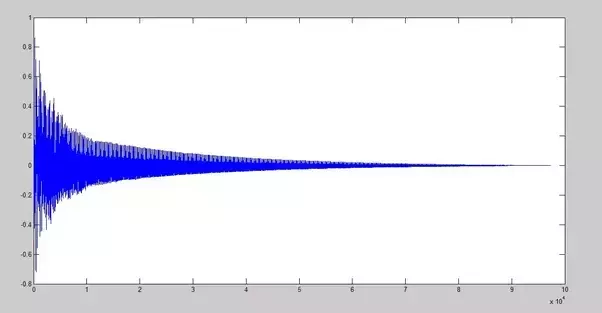
Notice the x axis. The axis reaches up to like 10x104.That’s the sample indexes.
If you need to convert the x-axis to time, you need to divide the x-axis by the sampling frequency.
Comments
Post a Comment